How to create a pivot table in Excel
- Pivot tables: A brief introduction.
- The advantages of pivot tables.
- A sample project to create a pivot table.
- Step-by-step instructions to create a pivot table on Excel.
- 1. Start creating a pivot table
- 2. Select the data range and location for the new pivot table.
- 3. Review the fields for the pivot table from the list.
- 4. Drag and drop the relevant fields to create your pivot table.
- 5. Find the required answers in percentage terms in the pivot table.
- 6. Confine your analysis by filtering the rows.
- 7. Adding an ‘Item Code’ field to individual rows.
- Conclusion:
Excel is a widely used computer program. It is necessary for carrying out calculations, data analysis, forecasting, drawing up repayment schedules, tables and charts, calculating simple and complex functions.
In Excel, it is also possible to create a pivot table, which in turn can greatly facilitate the work of many users.If you deal with data, then you probably use spreadsheets. Microsoft Excel is a widely popular spreadsheet software, and there’s a good chance that you use it. You can do a lot with Excel; moreover, repositories like Excel template provide very useful templates to improve your productivity. Excel also provides many powerful tools. One such tool that can help you to analyse data is “Pivot table”. How can you create a pivot table in Excel? Read on to find out.
Pivot tables: A brief introduction.
Let’s first understand what a pivot table is - a built-in feature of Microsoft Excel. A pivot table represents a summary of your data in an Excel spreadsheet. It provides useful charts that help you to understand the trends behind your data. You will likely need to create reports based on your data, and a pivot table makes this easy.
Why is it called a “Pivot table”? This is because you can rotate or transpose this table using another attribute of your data. Let’s gain a deeper understanding of this.
You might have thousands of rows in an Excel spreadsheet with multiple attributes or columns. A pivot table can help you to gain a perspective based on one of these attributes, whereas another pivot table can provide a perspective on another attribute.
For this, you just need to “rotate” the table, “pivoting” it on the other attribute. You don’t need to change the data in any manner, and neither do you need to add another column for this.
The advantages of pivot tables.
Why can learning to create pivot tables help you? Let’s assume that you have a spreadsheet with several thousand rows. This spreadsheet represents sales data for different products and it lists thousands of sales transactions.
It captures various information like revenue and cost for each transaction. You want to find out which product sells the most and which product delivers the highest profit percentage.
Without a tool like a pivot table, you would need to summarize the revenue and cost for each product from thousands of transactions. Subsequently, would you need to analyze which product delivers the most profit.
With the help of pivot tables, you can do this much more easily. This feature will summarize details like revenue and cost by product. You can even express them as percentages of total revenue and total cost.
The advantages of pivot tables are as follows:
- You can easily create them with only a few clicks.
- You can easily customize pivot tables and choose only the relevant columns, which keeps your analysis focused.
- Pivot tables summarize data present in thousands of rows and save manual effort.
You can easily identify patterns in the data with the help of pivot tables.
- Pivot tables help you easily create reports from your data.
A sample project to create a pivot table.
We will create a pivot table from a spreadsheet to solve a hypothetical problem. Let’s take a few minutes to understand the problem.
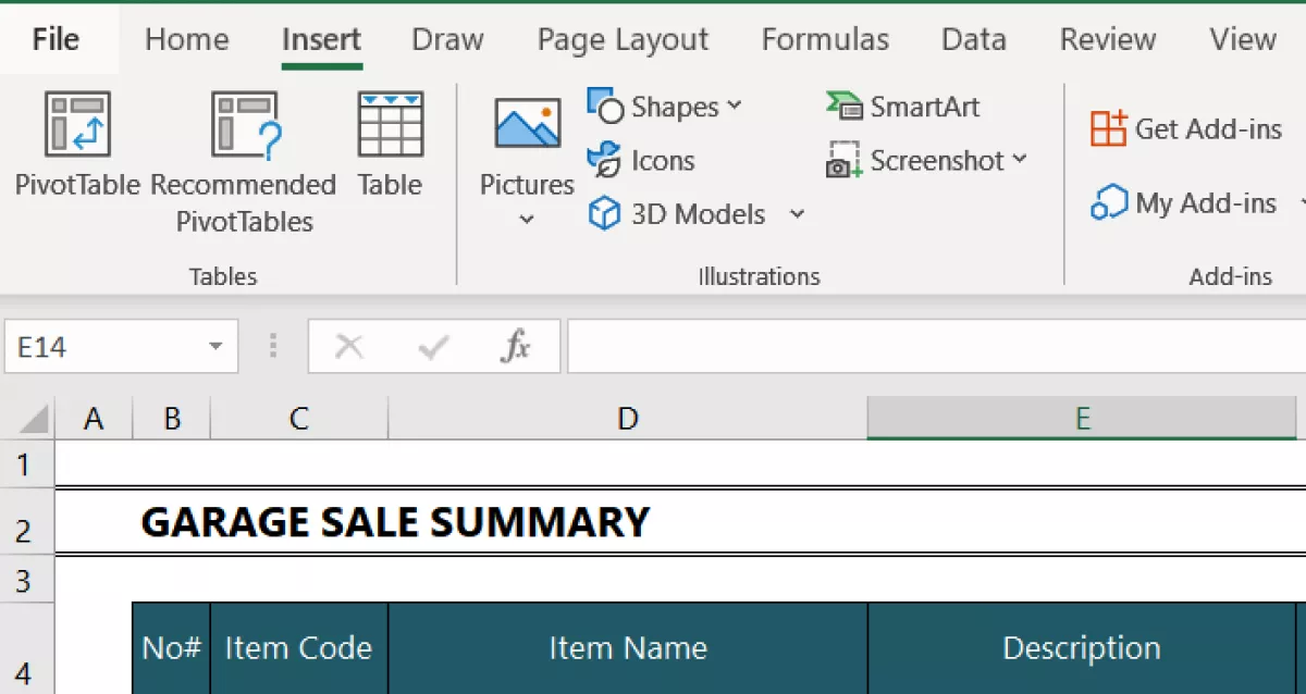
This tutorial uses a template which can be downloaded from here. The template is used to calculate a garage sale inventory and sale.
In the Excel sheet titled ‘Item List’ we have the following columns:
- Column B: No#.
- Column C: Item Code.
- Column D: Item Name.
- Column E: Description.
- Column F: Owner.
- Column G: First Sale Date.
- Column H: Market Price.
- Column I: Sticker Price.
- Column J: Actual Sale Price.
- Column K: Sold Date.
- Column L: Sold to.
- Column M: Buyer Phone.
Let’s assume that the seller who organised the garage sale wants to keep track of the items that were sold. The seller wants to know the total sum of all the items they are selling and the total sum they gained from items which were sold.

Step-by-step instructions to create a pivot table on Excel.
Take the following steps:
1. Start creating a pivot table
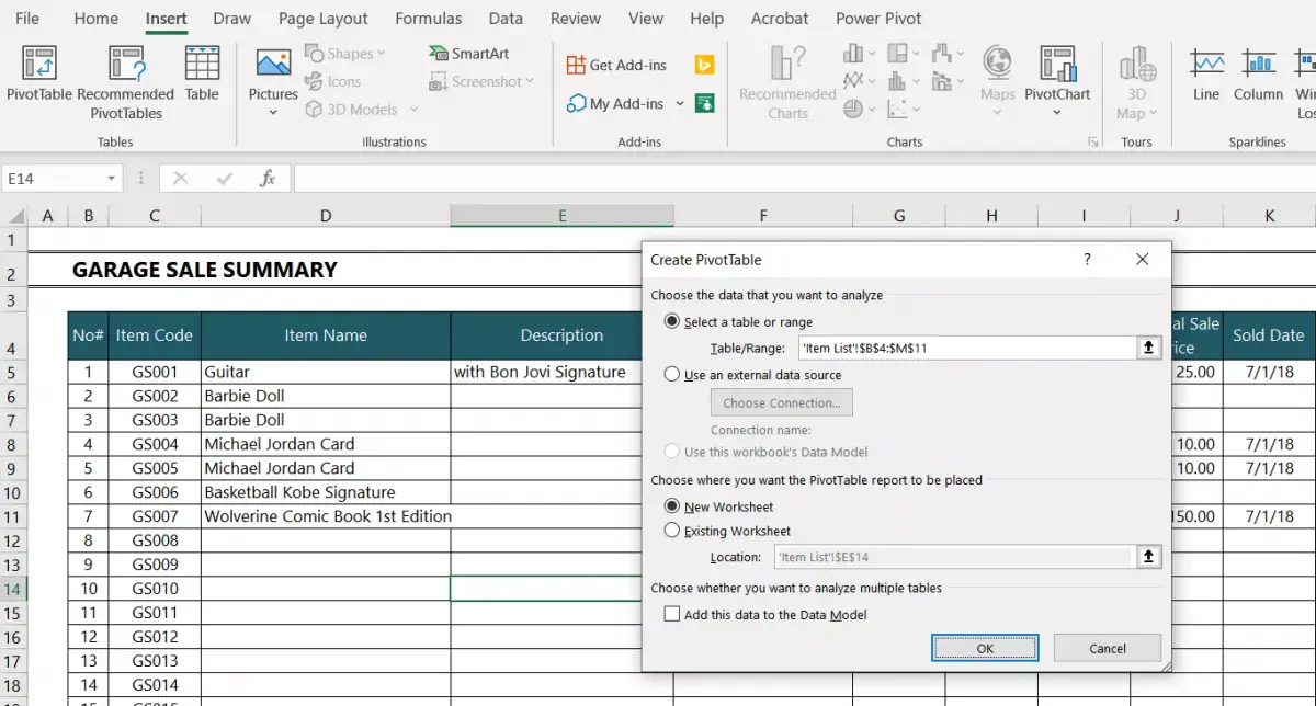
Click the “INSERT” menu option, and then click “Pivot Table”.
2. Select the data range and location for the new pivot table.
Select the data range including the columns from the data that you want in the pivot table. You need to ensure that all columns have a column heading.
Become an Excel Pro: Join Our Course!
Elevate your skills from novice to hero with our Excel 365 Basics course, designed to make you proficient in just a few sessions.
Enroll Here
By default, Excel also recommends that it will create a pivot table in a new worksheet. If you want to create the pivot table in the same worksheet, then you can choose that option. In that case, you need to specify the location.
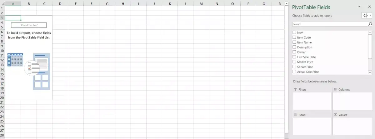
3. Review the fields for the pivot table from the list.
Look at the right-hand side pane where Excel displays the list of fields. It also shows the areas where you can drag and drop a field. The areas are named as follows:
- Filters.
- Columns.
- Rows.
- Values.
4. Drag and drop the relevant fields to create your pivot table.
In our hypothetical problem, we need to find the total number of items the seller has and the total amount they got from selling these items, as well as who the owner of the sold products was. Since we are analyzing the data for all items, we choose the “Item Name” column as the row in the pivot table. We drag the field “Item Name” into the “ROWS” area.
What are the values that we are analyzing in this sample project? These are sticker price, market price, and actual sale price. The corresponding columns in the main datasheet are “Sticker Price”, “Market Price” and “Actual Sale Price”, respectively. These are columns I, H and J in the main datasheet.
Now suppose that the seller wants to filter this data to calculate the amount they owe to the owner. They can create a filter for the same by adding the “Owner” field to the “Filter” area, as shown in the figure below.
You now have the answers to your problem. Let’s try something more: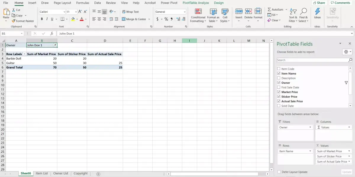
- Can we find the item pricing in percentage terms?
- Can we add an ‘item code’ field to the rows?
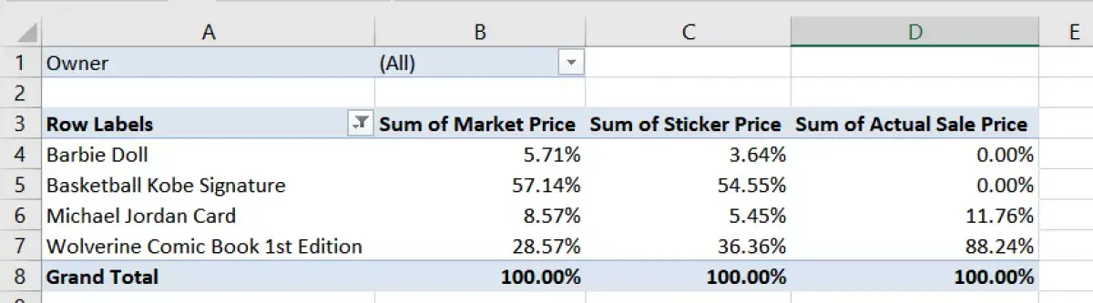
5. Find the required answers in percentage terms in the pivot table.
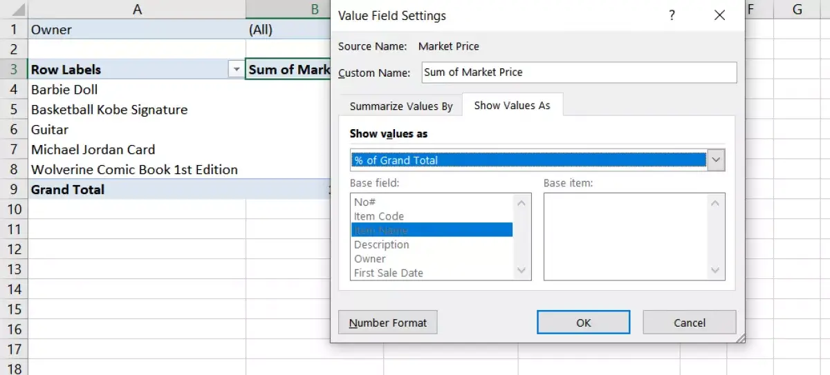
Instead of giving the prices in numbers, we can specify the percentage they constitute. You now need to represent them as percentages of the grand total. Click the drop-down menu on the “Sum of Market Price” field in the “VALUES” area of the drag-and-drop pivot table builder.
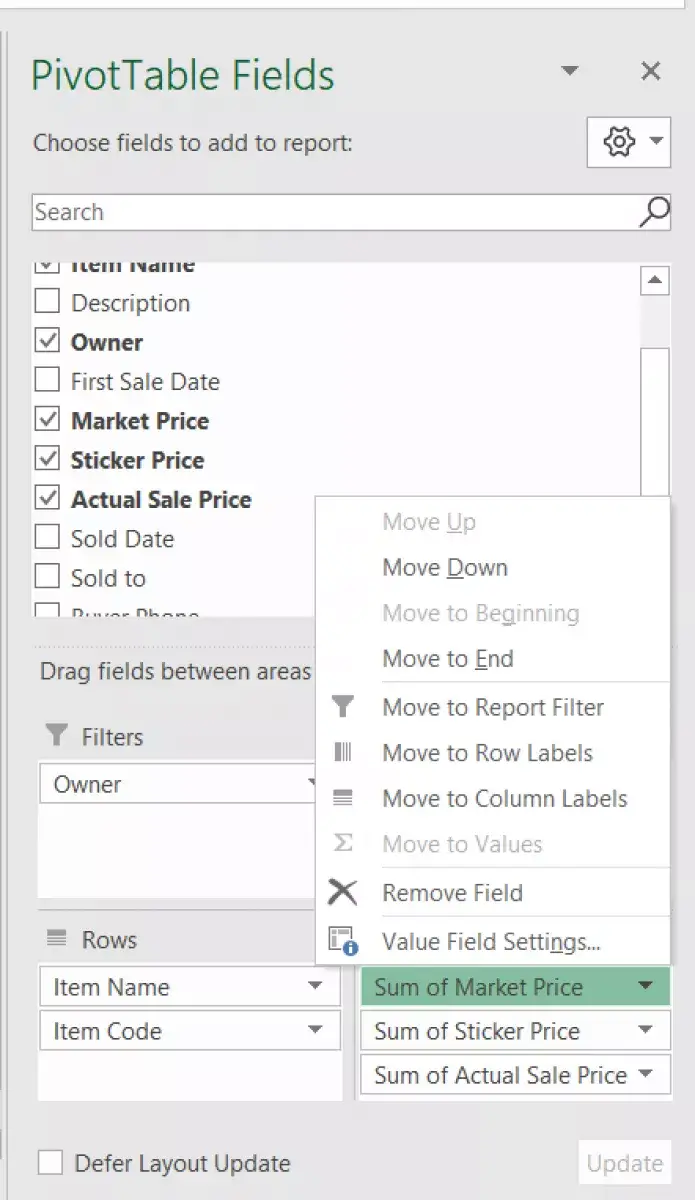
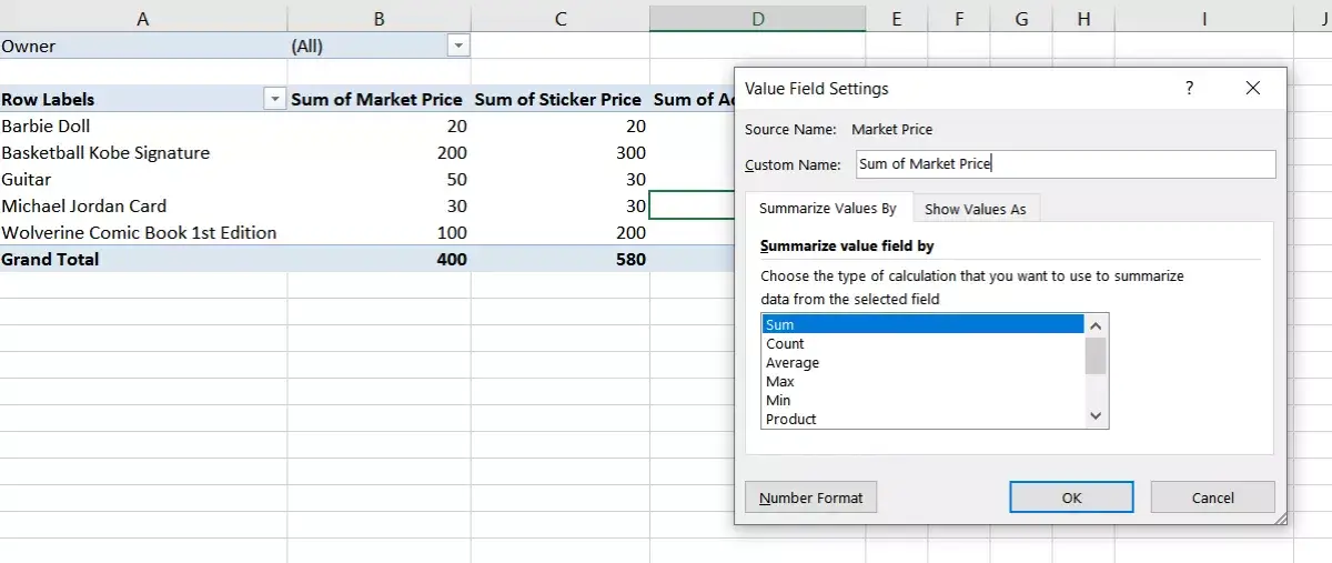
Select the “Value Field Setting” option, which is the last option in the drop-down list. Excel shows two kinds of options here. You can see the first kind of options in the tab named “Summarize Values By”. This has options like “Sum”, “Count”, “Average”, etc. We will not use these options for our specific problem.
We will use the second kind of options, which are listed in the “Show Values As” tab. Excel shows “No Calculation” by default here.
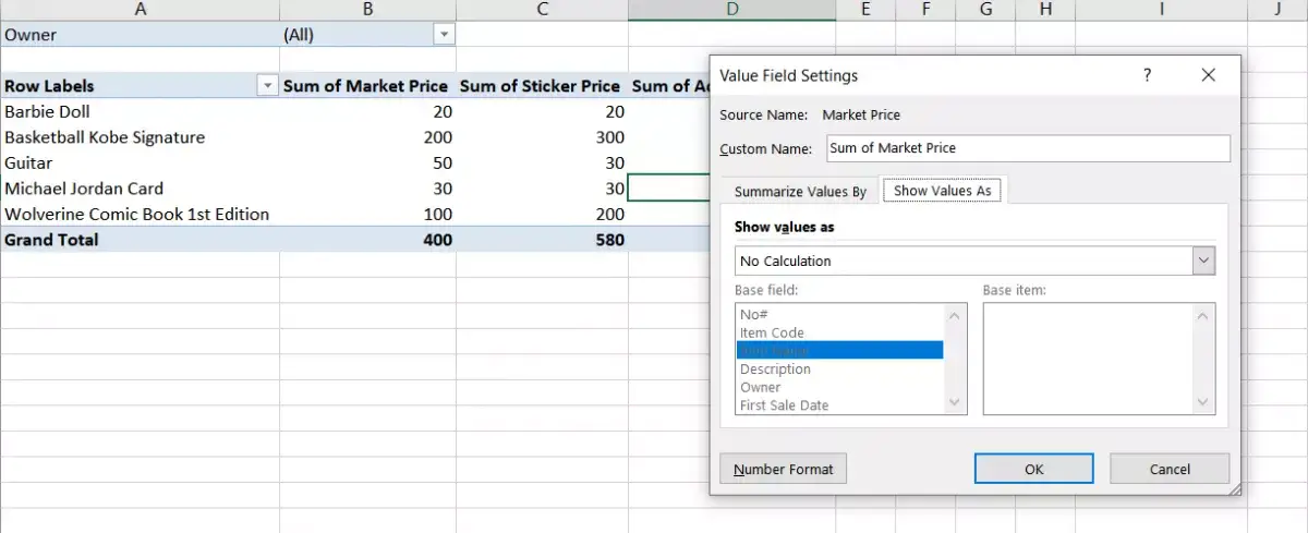
Now, you need to change “No Calculation” to “% of Grand Total” from the drop-down table. This is because you want to find the amount of each item as a percentage of the total amount.
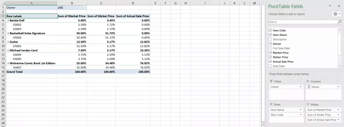
Refer to figure 10 to see the resultant pivot table. Here, the pivot table shows the revenue for each type of item in percentage terms. In this example, ‘Basketball with Kobe Signature’ has the highest market price.
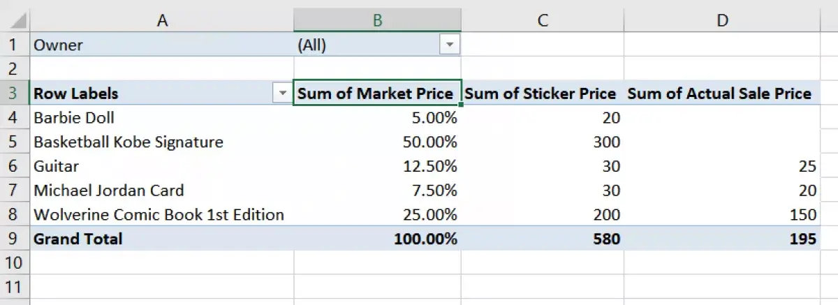
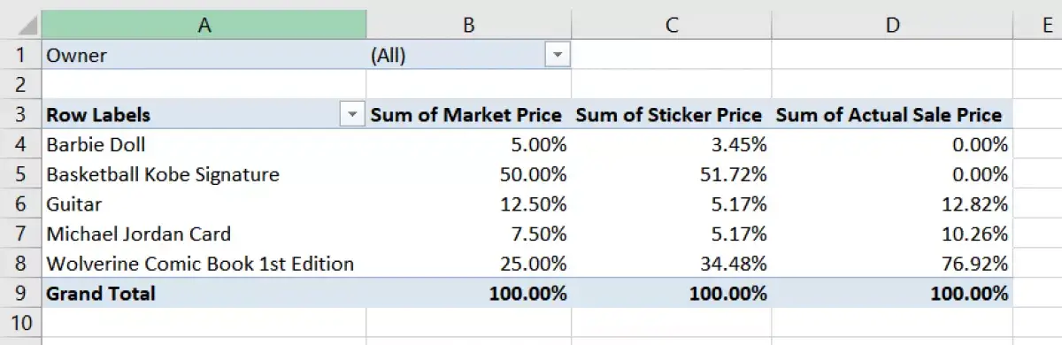
Now, similarly, let us check the other prices as a percentage, by selecting ‘% of Grand Total’ for both Sticker Price and Actual Sale Price.
6. Confine your analysis by filtering the rows.
What if you want to exclude an item from the analysis? You need to filter the rows in the pivot table. Click the drop-down list next to “Row Labels”.
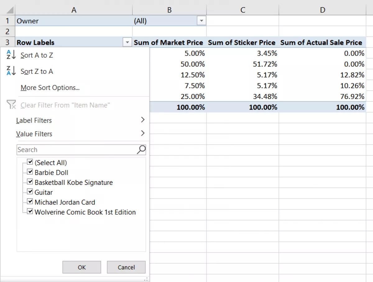
Remove the checkbox against the item that you want to exclude from the analysis. We removed “Guitar” in this example.
Once you exclude “Guitar” from the analysis, you can see that the percentage for other prices has changed, as now the total amount is different
7. Adding an ‘Item Code’ field to individual rows.
Now, to check the percentage of the total price by individual item code, let's drag and drop the ‘Item Code’ field to the “Rows” area of the drag-and-drop pivot table builder. Look at the resultant pivot table. The table shows the individual contribution of different item codes to the total price that the item has in the grand total.
Conclusion:
Microsoft Excel is a powerful tool. Moreover, repositories like Excel template provide very helpful templates that help you to achieve a lot quickly. On top of that, Excel has powerful built-in tools like pivot tables for data analysis. In this guide, we created a pivot table from Excel data using a simple, step-by-step approach. Use this powerful Excel tool to make sense of your data!
Snezhina is an aspiring marketing protege with passion for Excel. She is a Media and Entertainment Management graduate, with a background in film production and event management. In her free time she enjoys learning new languages, travelling and reading.
Become an Excel Pro: Join Our Course!
Elevate your skills from novice to hero with our Excel 365 Basics course, designed to make you proficient in just a few sessions.
Enroll Here