
Why a Mobile-First Design is Essential for Your Dropshipping Store
Just as you would prioritize your customers’ needs, you must recognize that mobile optimization is vital for your dropshipping store’s success. With more shoppers using their smartphones, adopting a responsive theme ensures your website looks great on any device. Simplifying navigation for mobile users will create a better shopping experience, while fast loading times will keep potential customers from abandoning their carts. Capturing the growing mobile commerce market begins with a design that meets the demands of today’s consumers.
Understanding Mobile-First Design
A mobile-first design approach prioritizes the user experience on mobile devices before creating a desktop version. Since mobile commerce continues to grow, starting your design process with mobile optimization ensures that your dropshipping store meets the needs of a rapidly increasing number of shoppers using smartphones. This method involves a streamlined strategy that focuses on important features and functionalities that resonate best with mobile users.
Definition and Principles
Mobile-first design refers to the practice of designing for the smallest screen first, then scaling up to larger screens. The key principles include simplicity, prioritization of important content, and responsive layouts that adapt seamlessly to various devices. By adopting this mindset, you ensure that your site provides a focused and efficient shopping experience for mobile users, enhancing engagement and reducing friction.
Benefits of Mobile-First Approach
The mobile-first approach offers numerous advantages, including improved loading speeds, higher conversion rates, and better user engagement. By designing for mobile, you address the specific needs of on-the-go shoppers, leading to a smoother interaction with your store. Statistics show that mobile-friendly websites experience a 20% increase in conversion rates and lower bounce rates, highlighting the effectiveness of this approach.
Expanding on the benefits, businesses that implement mobile-first design often see a significant boost in customer satisfaction. By prioritizing fast loading times and intuitive navigation tailored for mobile users, your store can effectively reduce friction and increase the likelihood of purchases. Furthermore, Google favors mobile-optimized sites in search rankings, enhancing your visibility in a competitive market. With more than 52% of global web traffic coming from mobile devices, your mobile-first strategy not only aligns with consumer behavior but also positions your dropshipping business for substantial growth.

Importance of Mobile Optimization for Dropshipping
Mobile optimization is a key factor in the success of your dropshipping store. With over 60% of online shoppers accessing websites through mobile devices, ensuring that your site provides a seamless mobile experience can significantly boost your conversion rates. A responsive theme, straightforward navigation, and quick loading speeds are non-negotiable elements that will enhance your store’s accessibility and appeal to a mobile-first audience.
Increasing Mobile Traffic
To attract more mobile users, prioritize a responsive design that automatically adjusts to various screen sizes. Statistics indicate that over 50% of eCommerce traffic now comes from mobile devices. By optimizing your site for mobile, you can capture this expanding market and enhance your visibility on search engines, leading to increased traffic and potential sales.
Enhancing User Experience
Optimizing your dropshipping store for mobile not only attracts visitors but also significantly improves user experience. Shorter loading times are vital; research shows that a one-second delay can decrease conversions by as much as 20%. Simplifying navigation enables quicker decision-making for users, while a clean, concise layout encourages longer visits and higher likelihood of purchases.
When shoppers browse your mobile store, they expect to find products quickly and easily. By incorporating intuitive gestures and straightforward categorization, you reduce friction in their purchasing journey. If your site takes longer than a few seconds to load or if users struggle to navigate, they’ll likely abandon their carts and turn to competitors. A well-optimized mobile experience cultivates trust and satisfaction, positioning your brand favorably in their minds and fostering repeat visits.

Responsive Themes for Mobile Devices
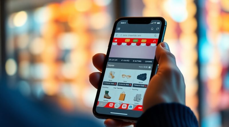
Choosing a responsive theme for your dropshipping store is vital for capturing mobile users. These designs automatically adjust to different screen sizes, ensuring your products look great on smartphones and tablets. You can explore insights on this topic in more detail in this article on Why Mobile-First Design Is the Game-Changer Every ….
Key Features of Responsive Design
Responsive design incorporates several key features that enhance user experience on mobile devices:
- Fluid Grids: Designs that adapt to any screen size.
- Flexible Images: Images that resize within their containing elements.
- Media Queries: CSS techniques that allow styles to change based on device characteristics.
- Touchscreen Compatibility: Ensures elements are easily clickable on touch devices.
- Fast Loading: Optimized assets to enhance speed on mobile networks.
The combination of these elements creates an engaging and efficient shopping experience.
Popular Mobile-Responsive Themes
In the world of dropshipping, several mobile-responsive themes stand out for their optimization and user-friendliness. Themes like Astra, OceanWP, and Shopify’s Debut are specifically designed to provide seamless browsing experiences. These themes often come with built-in features that prioritize mobile navigation, including simplified menus and quick product listings. Scalable layouts and fast load times are critical aspects that can significantly affect your store’s performance on mobile devices. Investing in a well-designed mobile-responsive theme not only enhances your credibility but also boosts conversion rates.

Simplifying Navigation for Mobile Users
Mobile users expect a seamless shopping experience, making simplified navigation important. Your site should prioritize ease of access to products and critical information without overwhelming the user. A well-structured navigation allows customers to find what they need quickly, ultimately boosting your conversion rates. Check out this article on Mobile-First Design: Putting the User First to learn more.
Streamlined Menus and Layouts
Creating streamlined menus and layouts helps eliminate clutter on small screens. Consider employing a hamburger menu to hide links until users need them, ensuring that important categories are easily reachable. By reducing visual noise, customers can focus on making decisions without distractions.
Importance of Touch-Friendly Elements
In mobile design, touch-friendly elements significantly enhance user experience. This means buttons should be large enough to tap easily, with adequate spacing to prevent accidental clicks. Aim for a minimum button size of 44×44 pixels to accommodate finger presses comfortably, ensuring accessibility for all users.
Incorporating touch-friendly elements is particularly important, as a frustrating interface can lead customers to abandon their carts. Research indicates that over 70% of mobile users encounter issues with small buttons or links. By optimizing your site for touch interactions—using larger buttons, clear call-to-action prompts, and intuitive gestures—you cater to the increasing number of shoppers who prefer mobile devices. Enhancing this aspect not only improves usability but also fosters a more enjoyable shopping experience, translating to higher sales for your dropshipping store.
Speed Matters: Fast Loading Times
Fast loading times directly influence the success of your dropshipping store. With mobile users having limited patience, a delay of just three seconds can result in a significant drop in conversions. Studies reveal that 40% of users abandon a website that takes more than three seconds to load. Optimizing your site for speed is not just beneficial; it’s important to keep customers engaged and drive sales.
Impact on User Retention
Your site’s loading speed plays a vital role in user retention. If your store loads slowly, users are more likely to leave and seek alternatives. Research indicates that 47% of consumers expect mobile pages to load in two seconds or less, with a poor experience often leading to negative brand perception. By ensuring fast load times, you foster a positive shopping experience that encourages repeat visits.
Tools to Improve Loading Speed
Utilizing effective tools is key to enhancing your site’s loading speed. Solutions like Google PageSpeed Insights, GTmetrix, and Pingdom provide insights on performance and suggest optimizations. Additionally, employing content delivery networks (CDNs) and image compression tools can drastically improve load times, directly impacting your sales and customer satisfaction.
Google PageSpeed Insights evaluates your site across various performance metrics, highlighting areas for improvement. GTmetrix and Pingdom offer comprehensive reports, detailing load times, waterfall charts, and recommendations tailored to your site. By leveraging these tools effectively, such as optimizing images and leveraging browser caching, you can cut load times significantly, ensuring a smoother user experience. This proactive approach not only enhances user satisfaction but also influences your store’s search engine ranking, ultimately boosting visibility and sales potential in the mobile market.
Mobile Checkout Process Optimization
To enhance your conversion rates, optimize the mobile checkout process by minimizing distractions and streamlining steps. Ensure your forms are concise, eliminating unnecessary fields to avoid overwhelming customers. Utilize auto-fill features and allow multiple payment options, including digital wallets, to simplify transactions. The faster and easier your checkout process, the more likely you are to secure sales.
Streamlining the Payment Journey
Streamlining the payment journey involves simplifying the entire transaction process. Utilize one-click purchasing options and create a visually appealing, clutter-free interface. By offering a range of popular payment methods, you accommodate various customer preferences, significantly enhancing user satisfaction during the checkout.
Reducing Cart Abandonment Rates
Reducing cart abandonment rates is pivotal for maximizing your sales potential. Consider implementing reminders and incentives such as discounts or free shipping offers, which can effectively encourage customers to complete their purchases. Understanding and addressing potential friction points in your checkout process can dramatically decrease abandonment rates.
Statistics show that approximately 70% of online shoppers abandon their carts, often due to complicated checkout processes. Ensure that your payment options are clearly displayed, and provide a guest checkout option to minimize friction. Utilize exit-intent pop-ups to engage users right before they leave, offering discounts or prompting them to review their carts. A seamless and encouraging checkout experience significantly boosts completion rates and overall sales for your dropshipping store.
To wrap up
Now, optimizing your dropshipping store for mobile is vital to meet the demands of an increasingly mobile-driven market. By implementing a responsive theme, you can ensure your site adapts seamlessly to various screen sizes, enhancing user experience. Simplifying navigation will help your customers find products effortlessly, while fast loading times will keep them engaged and encourage them to complete purchases. Adopting a mobile-first design approach positions your store for success, allowing you to tap into the vast potential of mobile commerce effectively.
FAQ
Q: Why is mobile optimization important for a dropshipping store?
A: Mobile optimization enhances user experience, ensuring your store is easy to navigate and visually appealing on smartphones. With increasing mobile shopping, a well-optimized site can lead to higher conversion rates.
Q: What role does a responsive theme play in mobile-first design?
A: A responsive theme automatically adjusts your store’s layout and content based on the device being used. This ensures that customers can view products seamlessly, regardless of screen size, preventing potential loss of sales.
Q: How can simplifying navigation improve mobile user experience?
A: Simplifying navigation helps users find products easily on smaller screens. Streamlined menus and easy-to-access categories reduce frustration and encourage users to explore your store, increasing the likelihood of purchase.
Q: Why are fast loading times imperative for mobile users?
A: Fast loading times are critical since mobile users are often on-the-go and may abandon a site that takes too long to load. Ensuring quick access to your store can significantly enhance user retention and overall sales.
Q: What is the impact of mobile commerce trends on dropshipping stores?
A: As mobile commerce continues to grow, failing to adapt can lead to missed opportunities. A mobile-first design positions your dropshipping store to tap into this expanding market, reaching a broader audience and maximizing profits.