
How to create a dashboard in SalesForce Lightning and add components?
How to create a dashboard in SalesForce
Creating a dashboard in SalesForce will allow you to access quickly and efficiently the most important information for your activity.
To create one, simply go to dashboards in the navigation apps > new dashboard, and add the components that are necessary for your quick visualization.
Create a new dashboard
To create a new dashboard, start by access the dashboards app from the navigation panel on the main screen.

From there, the recent dashboards will be displayed, if any of them are available. Otherwise, you can create a new dashboard by clicking on the new dashboard button.

Dashboard creation procedure
The first step to create a new dashboard is to enter a name for the dashboard, which is mandatory.
In case you have many dashboard, it might be useful to enter a description as well, in order to retrieve it faster in the future.
It is also possible to store the dashboard in a defined folder, in order to have all your dashboards properly stored by dashboard type or usage for example.

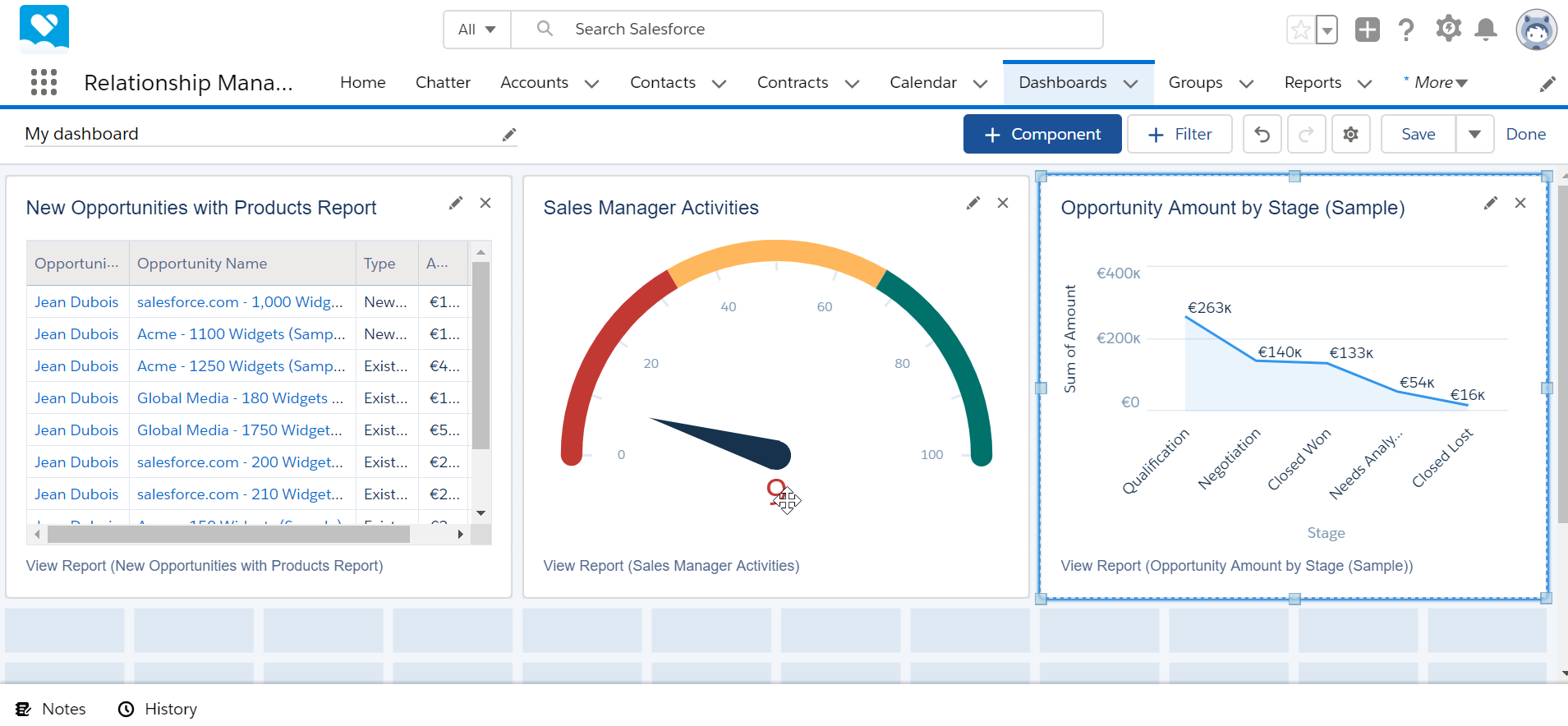
Adding components to a dashboard
Once the dashboard has been created, it will come empty, without any component added. A certain amount of squares will be available, and components can be added and scaled to fill up these tiles.
Press the plus component button to create a new component.

A component can be a report or a folder, and the next screen will allow to look for an existing report or folder.
Search for the report or folder you would like to use in the current dashboard, and select it.

Once the report has been selected, it is necessary to select how that report will be displayed as a component in the dashboard: should it be raw data in a table, should it be a chart like a pie or a bar chart, which fields should be used in that component, and many other options.
Select how the report should be displayed, and scroll down the left hand side part to see more options.

Going down in the list of options for that component, it is possible to select the columns to display in the report, which is especially useful when switching to a chart, in which most likely some columns will not bring any added value.

Going further down in the option list, more options are available, like selecting the column on which data should be sorted, what display units should be used in the dashboard created, should totals be shown, and more.

Component chart preview
Once the right options have been selected, the component should be displayed as a preview in that same window, and can be modified until clicking on the add button to add the component to the dashboard.

Don’t hesitate to play with the different chart types available until finding the one that will allow you best to take decisions or other action from that dashboard’s informations. The preview area will be updated as soon as you click on another chart type.

Once several components have been added to the dashboard, it will look more useful, and should serve its purpose, to quickly display real time information based on the reports that have been selected.
