
Quickly add a chart to report in SalesForce Ligthning
Adding a chart to a report in SalesForce Lightning
When the button add chart is greyed out in a report created in SalesForce do not panic – a simple manipulation has to be made to be able to create a chart from that report, and the trick can be used anytime when creating reports in SalesForce: group records together for chart generation.
Solve add chart SalesForce report grayed out: group report data on one fieldAdd Chart button is disable on my report screen
Have you read?
Get around the greyed out add chart button by grouping data
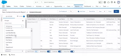
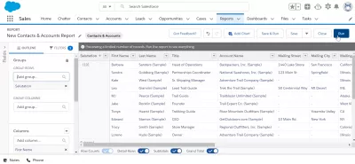
Open your report created in SalesForce and click on the edit button in the top right corner of the report visualization screen to access report options and get around the greyed out button.
The next step is to add a group of data. For example, if you want to report on how many Mister, Miss and Doctors are available in your list of SalesForce accounts and SalesForce contacts then select the salutation field for grouping.
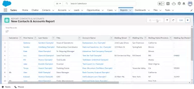
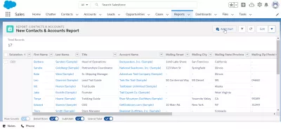
The raw data that can be used to exporting data from SalesForce to Excel in the report table view is now grouped by the salutation field as you can see in the preview tab.
However, data hasn’t been set yet and report hasn’t been yet updated. To do so, click on the RUN button.
unable to add chart to custom report
Generate chart from report
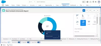
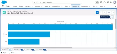
Back on the report visualization screen, the button “Add Chart” is now available for data that has been grouped on one field!
After clicking on the add chart button, the chart creation screen will be displayed, with a standard chart visualization selected by default, which might depend on the type of data that was available in the report, and the field used for grouping.
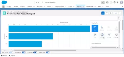
Click on chart properties to change the type of chart used.
Different types of charts are available: bar, column, stacked bar, stacked column, line, donut, funnel, scatter plot, and much more.
Depending on the grouped data, different charts will be available or not for the chart generation from report.
Selecting a donut visualization, the new chart created from report will be available and can be used and reused in SalesForce dashboards or for exporting data from SalesForce to Excel and create beautiful reports with charts.